Filter
34
Featured
12
1
Topics
15
9
6
5
4
4
3
3
3
3
3
2
2
2
2
2
2
2
2
2
2
2
2
2
2
2
1
1
1
1
1
1
1
1
1
1
1
1
1
1
1
1
1
1
1
1
1
1
1
1
1
1
1
1
1
1
1
Language
Document type
29
3
1
1
Countries / Regions
Authors & Publishers
Media focus
Publication Years
Methods applied
Output Type
Better Data Visualizations: A Guide for Scholars, Researchers, and Wonks
New York: Columbia University Press (2021), xi, 449 pp.
"This book details essential strategies to create more effective data visualizations. Jonathan Schwabish walks readers through the steps of creating better graphs and how to move beyond simple line, bar, and pie charts. Through more than five hundred examples, he demonstrates the do's and don'ts of
...
Information Visualization: Perception for Design
Cambridge, MA: Elsevier, 4th ed. (2021), xix, 538 pp.
"Information Visualization: Perception for Design, Fourth Edition explores the art and science of why we see objects the way we do. Based on the science of perception and vision, the author presents the key principles at work for a wide range of applications--resulting in visualization of improved c
...
Do no Harm Guide: Applying Equity Awareness in Data Visualization
Washington, DC: Urban Institute (2021), 43 pp.
Supplementing Emergency Warning Messsages to Encourage Readiness to Act: The Effect of Colour and Icons
Melbourne: Bushfire and Natural Hazards CRC; Queensland University of Technology (2021), 52 pp.
"An online survey was conducted in which participants were exposed to one of 16 mock emergency warnings about either a bushfire or a riverine flood and were then asked a series of questions relating to their demographic characteristics, message comprehension and effectiveness, threat appraisal, copi
...
The Data Visualization Workshop: A Self-Paced, Practical Approach to Transforming Your Complex Data Into Compelling, Captitative Graphics
Birmingham: Packt Publishing, 2nd ed. (2020), vii, 504 pp.
Storytelling with Data: Let's Practice!
Hoboken, NJ: Wiley (2020), xvi, 427 pp.
"Each chapter starts with a brief recap of the key lessons that are covered in storytelling with data. This is followed by: 'practice with Cole': exercises based on real-world examples posed for you to consider and solve, accompanied by detailed step-by-step illustration and explanation; 'practice o
...
Data Story: Explain Data and Inspire Action Through Story
Oakton, Virginia: IdeaPress Publishing (2019), vii, 224 pp.
"Duarte and her team have culled through thousands of data slides of her clients in technology, finance, healthcare, and consumer products, to decode how the highest performing brands communicate with data. DataStory teaches you the most effective ways to turn your data into narratives that blend th
...
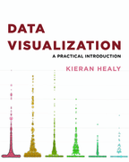
Data Visualization: A Practical Introduction
Princeton, NJ; Oxford: Princeton University Press (2019), xviii, 272 pp.
"This book provides students and researchers a hands-on introduction to the principles and practice of data visualization. It explains what makes some graphs succeed while others fail, how to make high-quality figures from data using powerful and reproducible methods, and how to think about data vis
...
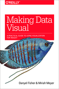
Making Data Visual: A Practical Guide to Using Visualization for Insight
Sebastopol, Calif.: O'Reilly Media (2018), xiii, 149 pp.
"If you're a data scientist trying to navigate the murky space between data and insight, this practical book shows you how to make sense of your data through high-level questions, well-defined data analysis tasks, and visualizations to clarify understanding and gain insights along the way. When inco
...
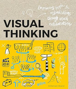
Visual Thinking: Empowering People & Organizations Through Visual Collaboration
Amsterdam: BIS Publishers (2017), 144 pp.
"Visualizing thought processes can help break down complex problems. It empowers teams and staff to build on one another's ideas, fosters collaboration, jump-starts co-creation and boosts innovation. This book will help brush aside misconceptions that may have prevented you using these techniques in
...
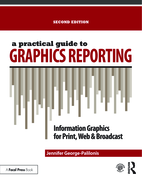
A Practical Guide to Graphics Reporting
London; New York: Routledge, 2nd ed. (2017), 229 pp.
"Since this book first published in 2006, the field of graphics reporting has changed dramatically. First, information visualization has exploded online and on other digital platforms. Second, information graphics reporting has encompassed nearly every sector of communication and business. Visual re
...
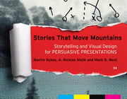
Stories That Move Mountains: Storytelling and Visual Design for Persuasive Presentations
Chichester: Wiley (2013), 259 pp.
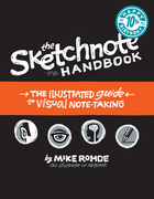
The Sketchnote Handbook: The Illustrated Guide to Visual Note Taking
San Francisco: Peachpit Press; Pearson Education (2013), xv, 205 pp.
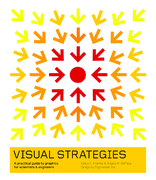
Visual Strategies: A Practical Guide to Graphics for Scientists & Engineers
New Haven, Conn.; London: Yale University Press (2012), 53 pp.
"Any scientist or engineer who communicates research results will immediately recognize this practical handbook as an indispensable tool. The guide sets out clear strategies and offers abundant examples to assist researchers-even those with no previous design training-with creating effective visual
...
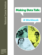
Making Data Talk: A Workbook
National Cancer Institute (2011), 44 pp.
"This workbook provides an overview of the main points contained in the book 'Making Data Talk: Communicating Public Health Data to the Public, Policy Makers, and the Press', as well as practical exercises for applying the book’s concepts and communication principles to your unique situation. The
...
Visualizing Information for Advocacy: An Introduction to Information Design
Key Guides
Tactical Technology Collective (2008), 43 pp.
"How do you tell your story effectively? How can NGOs make their messages as attractive and compelling as other, competing, information? By using information design. Information design can help tell your story to a variety of constituencies. You can use it as an advocacy tool, for outreach or for ed
...
