Filter
27
Featured
12
1
1
Topics
5
3
2
2
2
2
2
2
2
2
1
1
1
1
1
1
1
1
1
1
1
1
1
1
1
1
1
1
1
1
1
1
1
1
1
1
1
1
1
1
1
1
1
Language
Document type
13
3
1
Countries / Regions
Authors & Publishers
Media focus
Publication Years
Methods applied
Journals
Output Type
Convergent Journalism: An Introduction. Writing and Producing Across Media
Burlington, Mass.; Abingdon, Oxon: Focal Press, 2nd ed. (2015), 246 pp.
Visual Strategies: A Practical Guide to Graphics for Scientists & Engineers
New Haven, Conn.; London: Yale University Press (2012), 53 pp.
"Any scientist or engineer who communicates research results will immediately recognize this practical handbook as an indispensable tool. The guide sets out clear strategies and offers abundant examples to assist researchers-even those with no previous design training-with creating effective visual
...
Making Data Talk: A Workbook
National Cancer Institute (2011), 44 pp.
"This workbook provides an overview of the main points contained in the book 'Making Data Talk: Communicating Public Health Data to the Public, Policy Makers, and the Press', as well as practical exercises for applying the book’s concepts and communication principles to your unique situation. The
...
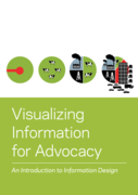
Visualizing Information for Advocacy: An Introduction to Information Design
Key Guides
Tactical Technology Collective (2008), 43 pp.
"How do you tell your story effectively? How can NGOs make their messages as attractive and compelling as other, competing, information? By using information design. Information design can help tell your story to a variety of constituencies. You can use it as an advocacy tool, for outreach or for ed
...
A Methodology for the Graphical Exposition of Broadcasting Systems
Köln: Institut für Rundfunkökonomie an der Universität zu Köln (2007), 45 pp.
"This paper is a methodological supplement to the Working Paper No. 223e of the Institute for Broadcasting Economics by Manfred Kops: "A Revenue-Based Methodology for the Classification and Comparison of Broadcasting Systems". It explains the methodology to generate graphs that describe and compare
...
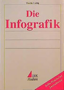
Die Infografik
Konstanz: UVK Medien (1999), 460 pp.
"Karten, Diagramme und Schnittzeichnungen kamen vor wenigen Jahren in Zeitungen und Zeitschriften kaum vor. Inzwischen haben Infografiken in den Printmedien und im Internet einen Siegeszug angetreten. Martin Liebig beschreibt anhand von zahlreichen Beispielen das neue Darstellungsmittel in seinem ge
...
